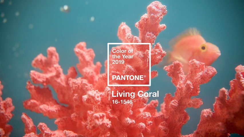
Pantone has announced its 2019 Colour of the Year as Living Coral, a bright and uplifting pink-orange hue symbolising “our innate need for optimism and joyful pursuits.”
The choice feels incredibly apt – in a year that promises uncertainty, both politically and economically, it’s only natural that we look to other areas to bring us something more positive. Having analysed ‘macro-influences’ over the past year, Living Coral is a surprisingly cheerful choice, perhaps suggesting an uncertain world is finding comfort in bold, confident colours.
Pantone say that Living Coral is also a response to the increasingly prominent digital landscape that we find ourselves in and represents our desire to seek “authentic and immersive experiences that enable connection and intimacy.” The colour represents colours found in nature and the digital sphere, highlighting the human desire to connect both online and offline.

Living Coral is an orange-pink hue with a golden undertone. Image Source: Pantone
As Leatrice Eiseman, Executive Director of the Pantone Colour Institute, explains “Colour is an equalising lens through which we experience our natural and digital realities and this is particularly true for Living Coral. With consumers craving human interaction and social connection, the humanising and heartening qualities displayed by the convivial PANTONE Living Coral hit a responsive chord.”
The colour also shines a light on the importance of our coral reefs in providing shelter and nourishment for much of our sea life, something that is threatened by global warming and our changing ecosystem. The term ‘Living Coral’ is a stark contrast to the large amounts of dead and bleached coral found in our oceans.
Following on from last year’s Ultra Violet, Living Coral is described as “an animating and life-affirming coral hue with a golden undertone that energizes and enlivens with a softer edge.” The colour is predicted to dominate the design world over the coming year, in everything from clothing to homeware.

The Monroe Bed coming to Heal’s in Spring 2019
Whether you use it within your home accessories or as a statement colour for your bed, Living Coral is a perfect accent colour for offsetting cooler grey and blue tones. Our Monroe bed, launching later this year, will be available in a coral linen, perfect for those wanting to inject a pop of colour to their bedrooms. Effortlessly mixing generous proportions with feminine, sweeping lines, the warm tone is the perfect colour to highlight its winged headboard.
Alternatively, for a more understated look, opt for smaller items of furniture or home accessories to bring coral into your home. Take a look at our Living Coral inspired picks below: