In The Studio: Maddison Graphic
We caught up with the guys from Maddison Graphic to see the finishing touches being made to their new series of limited soft accessories for Heal’s.
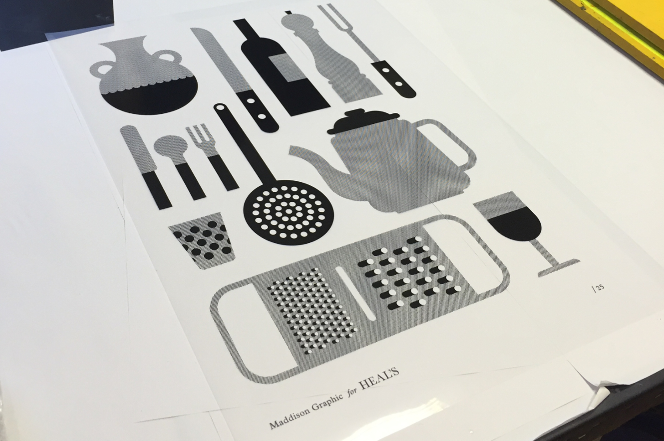
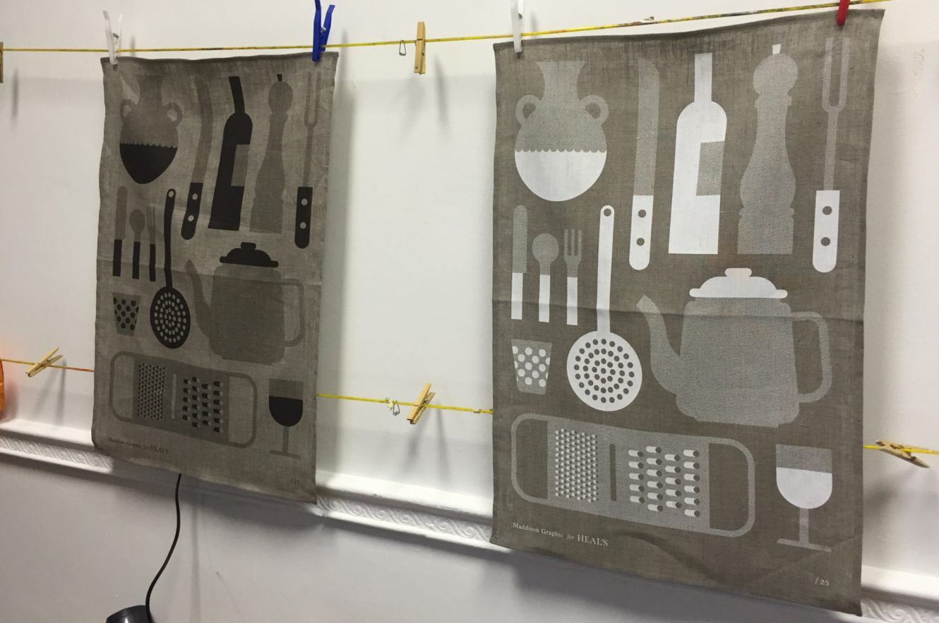
Working from their studio in Norwich, this independent design studio specialise in modern graphic prints across a range of area from exhibitions to fashion. Having garnered heaps of praise from the design press, we were thrilled to have them on board for Heal’s new series of limited edition designer tea towels and thought it only right to see the first run of prints in person.
—
Do you have any studio superstitions?
No, we are tediously rational.
What is the inspiration behind your work?
We are a conventional graphic design studio, so our inspiration comes from our clients. Of course it’s inevitable that our portfolio has some character or style, but it is our intention that the work primarily serves the necessities of the brief. We like to approach self-initiated projects in the same way, the type of object and the expected use are at the forefront of our thinking.
Tell us about your design process, how do you get started?
First we think about the purpose of the design and begin to look at other examples of an object or publication that we think are successful. We are concerned with communicating an idea in as straightforward a way as possible and reducing clutter and noise while retaining warmth and play where appropriate.
Everyone has a personal reaction to colour, are there any you instinctively avoid?
Using colour is difficult and subtle and it is easy to make something ugly and blame the colour, but it is all about context.
Do you have a preferred material or process?
Our work is almost always printed, so we try to use the most appropriate technology and material for each project. We consider the choice of material and process as important an aspect of our work as the design itself.
How would you describe your new design for Heal’s?
We wanted to produce an object that was useful attractive and would be something that we might buy ourselves. Although the design is quite bold, the use of natural linen and a monochrome palette create a pleasing and harmonious object.
Wellbeing: Hoarding design on the theme of well-being for a hospital development in Cambridge.
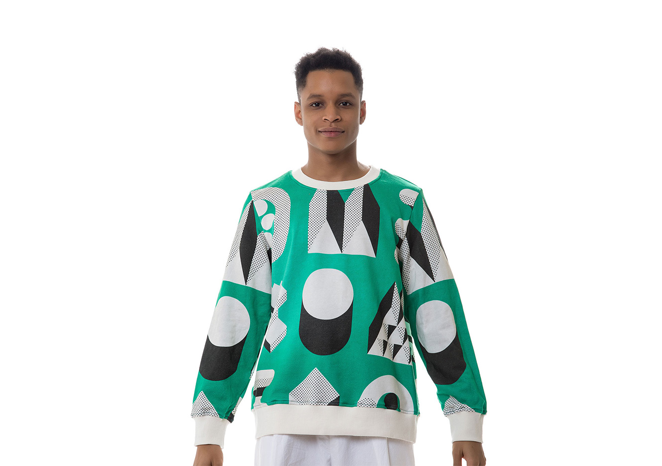
Print All Over Me: sweatshirt design for Print All Over Me, an online retailer that works with artists and designers.
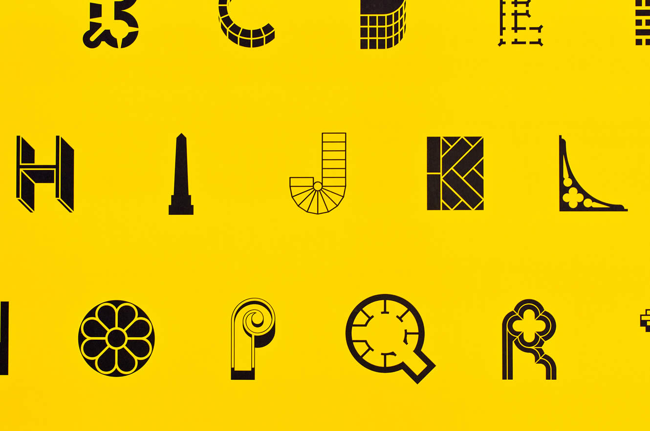
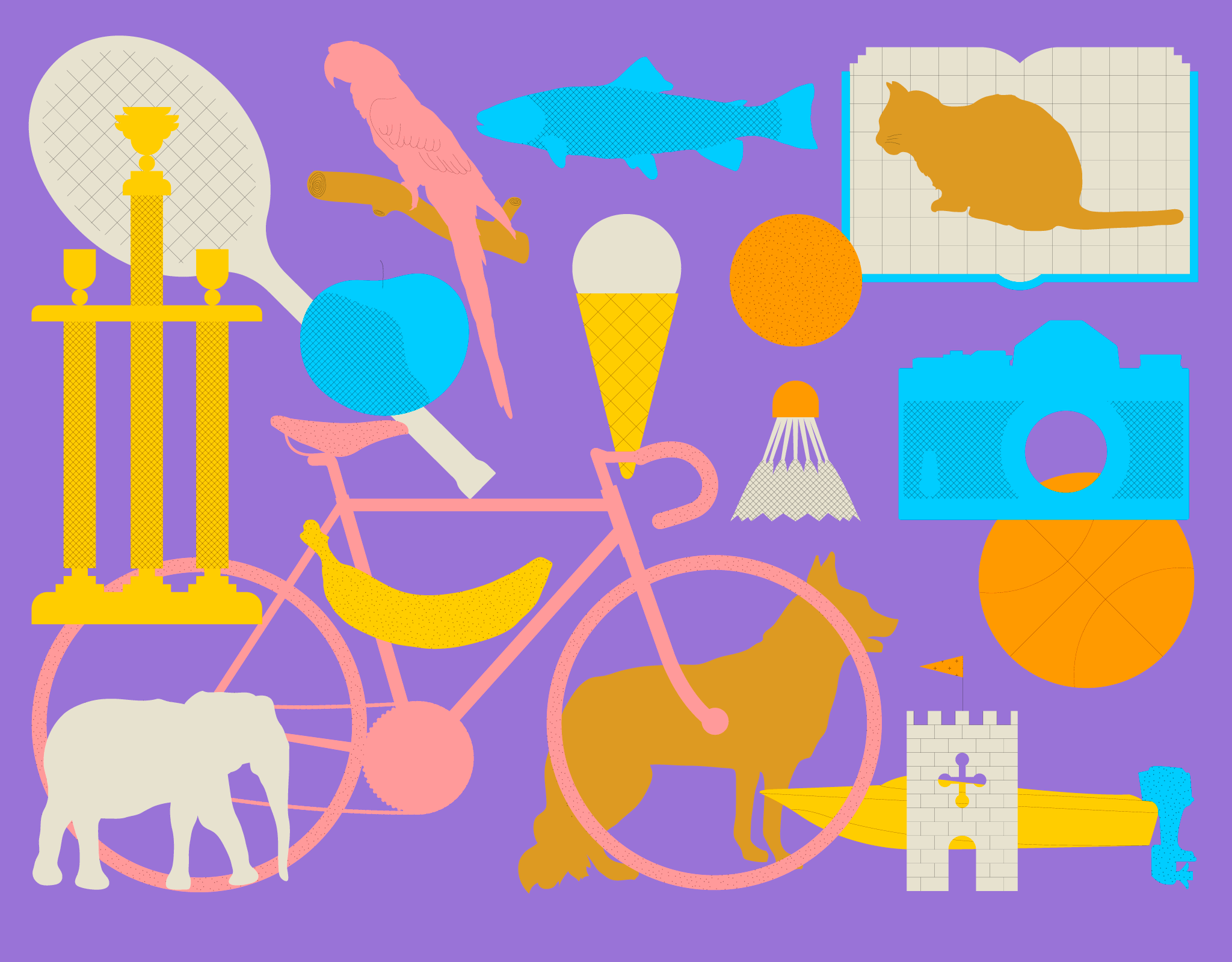
Architectural Alphabet: typographic print inspired by iconic buildings and architectural motifs.
Further Reading:
www.maddisongraphic.com