Artworks in their own right, Katie Charleson’s vibrant prints evoke the wild style of post-modern design.
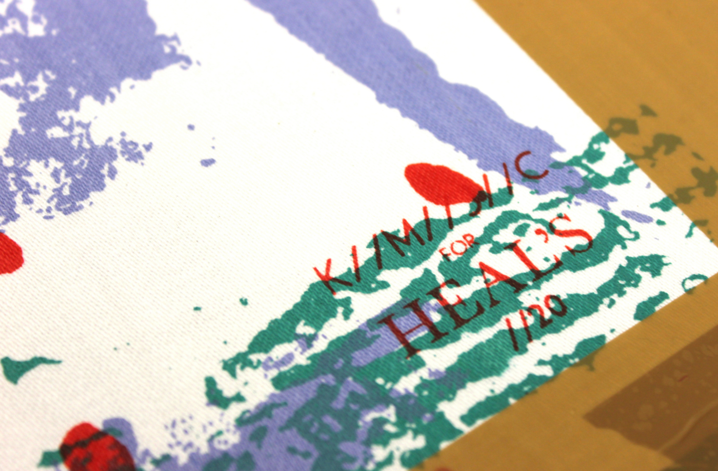
Having recently launched her exclusive range of hand printed tea towels at Heal’s, we caught up with the designer at her South London studio to discuss her colourful collage aesthetic and see the finishing touches being made to the new collection. If you’d like to try you hand at Katie’s unique collage style of screen printing, pop in store today to print your own tote bag with the designer herself.
—
Tell us about the first piece you ever designed?
When I was little I used to trace photos of models out of magazines and draw my own fashion designs onto them – a lot of couture gowns! But the first textile piece I made at college was a strange sort of applique representation of a graffiti wall in Edinburgh in mixed media with very muddy colours. Needless to say I have moved on!
Where is your studio based?
I studied Textiles at Glasgow School of Art, specialising in Print, but my studio is now in Elephant & Castle, South London. I share the print space with some fantastic printmakers, artists and designers, so it is a very inspirational place to work.
Do you have any studio superstitions?
I hate waste and keep all scraps of fabric and off-cuts for sampling or future ideas. I even have a box of paper scraps (some of which I know go back to college days) that I use to create new works.
“The most important element is always
the colours and how they sit together
to create beautiful juxtapositions.”
What is the inspiration behind your designs?
Inspiration comes from collecting different lines, brush marks and shapes, then collaging and layering them all together. The most important element is always the colours and how they sit together to create beautiful juxtapositions.
Do you have a design hero that influences your work?
I’m influenced by a wide variety of artists and designers with differing styles, from the graphic prints of Eley Kishimoto to more painterly print designers like Luli Sanchez, or even fantastical artists like Julie Verhoeven.
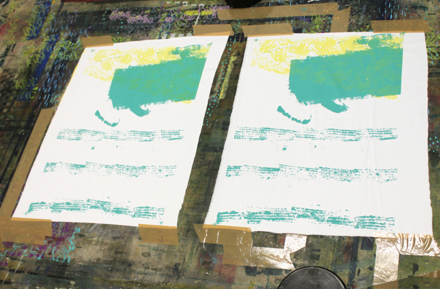
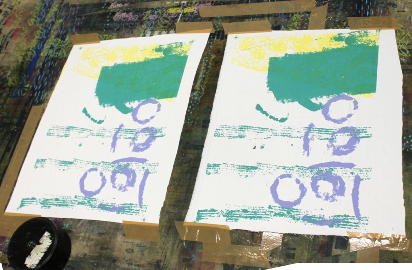
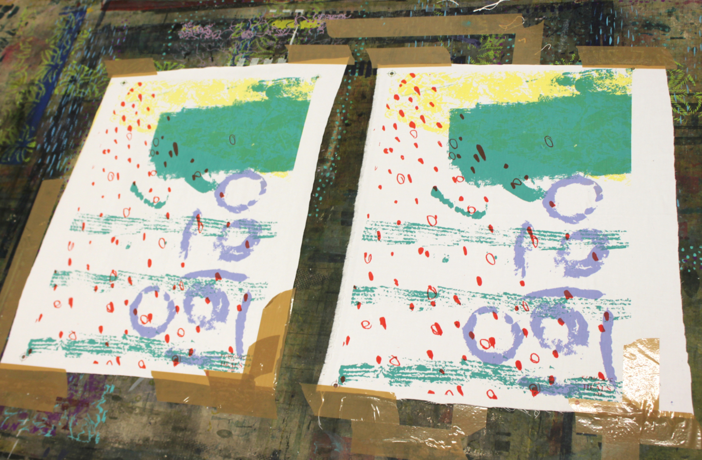
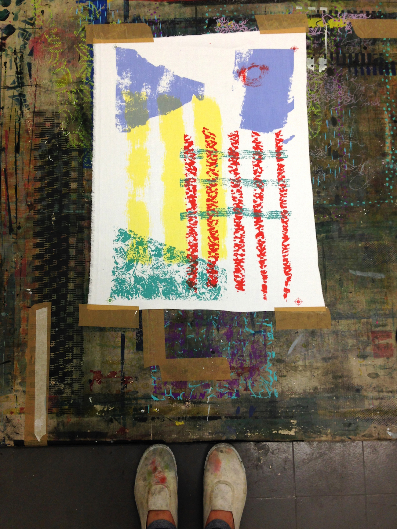
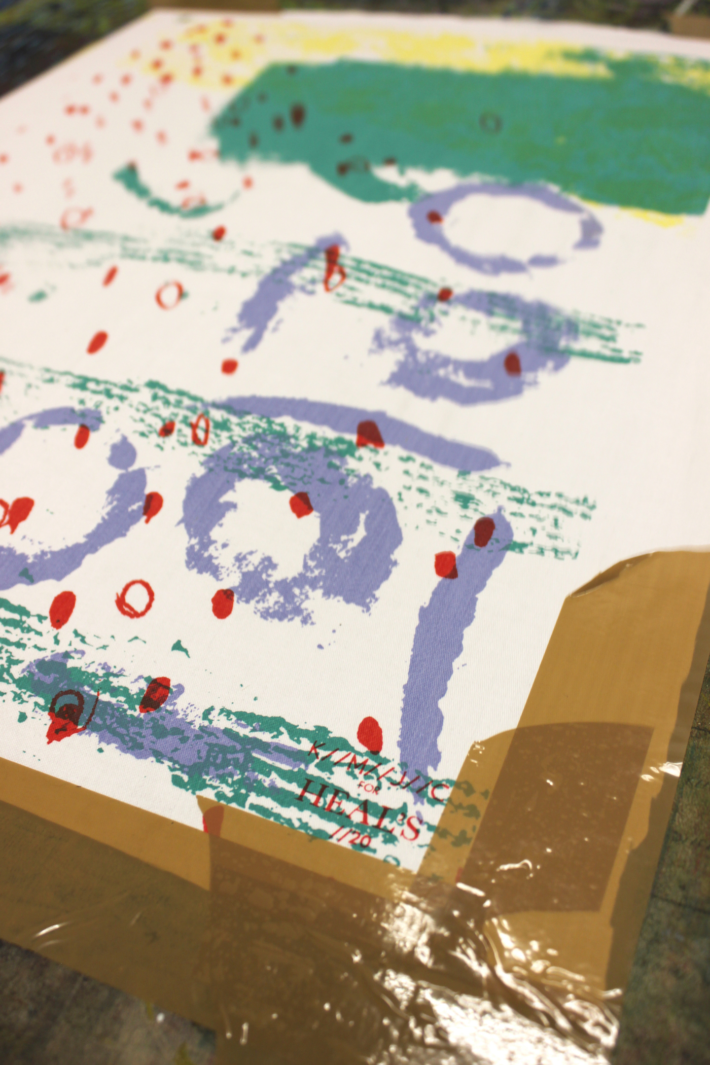
The fine print: screen-printing involves layering each colour one by one to create the finished design.
Tell us about your design process, how do you get started?
I collect interesting marks, textures and even scraps of colour and paper over time that I usually start by collaging and experimenting with. Sometimes I might combine these with more figurative drawings of plants and flowers, for example.
“Growing up I was told “red and green should never be
seen”, which you can see from this collaboration
is a statement that I actively reject!”
This limited edition collaboration with Heal’s, however, is completely abstract and was more about finding shapes and colours that combined to create the most sunny energy and vibrancy.
Do you have a preferred material or process?
My first love is screen printing. I really enjoy the process and physical activity of it plus the tactile quality of screen-printed fabrics. Recently I have started painting directly onto fabrics with dyes, which gives a diffused effect when combined with the more graphic lines of screen-printing.
Everyone has a personal reaction to colour, are there any you instinctively avoid?
Growing up I was told “red and green should never be seen”, which you can see from this collaboration is a statement that I actively reject! I love combining colour in unexpected ways, using tone to make potentially jarring colours work together.
How would you describe your new range for Heal’s?
While the prints are obviously functional as Tea Towels, I also see them as fun and vibrant artworks in their own right. The different marks and shapes give the pieces energy and the colours make them fresh and summery.